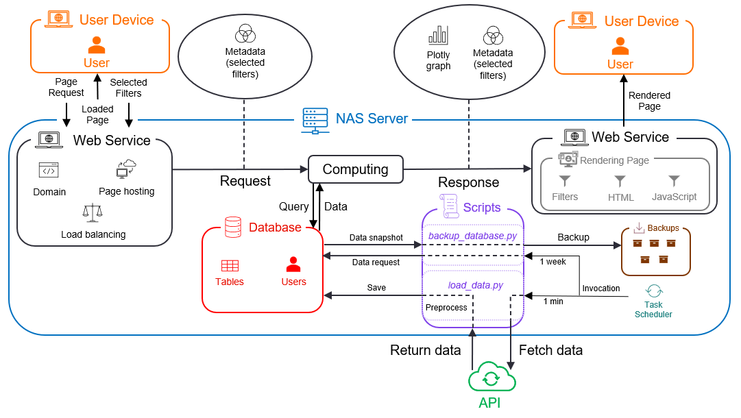
About the App
The application uses Flask to display data from the Smart Home Monitoring system. with the use of a filtering system, it is possible to define a time/date range and the set of individual appliances to display the data for.
How it works
After selecting the desired filters, you can click the Filter button which sends a POST request to the application. Upon receiving this request, the application will fetch the data from the database based on your selected criteria and render it on the page using a Plotly graph. This task flow is depicted in the figure below:
Available pages
So far, the available routes include only two pages - Index page and Dashboards page. The bulk of the application is contained within the Dashboards page. The backend functions that run behind the scenes are explained below in this section.
Why it might take time to process the request
Each stage of the process outlined in the previous section takes some time to complete. First, the query execution depends on the complexity of that query, as well as the number of data points that fall within the query criteria. The wider the time range, for example, the more data will have to be processed/displayed.
Second, it takes a considerable amount of time to render a large number of data points. In fact, plot rendering takes up the majority of the time necessary to process your request. Unfortunately, this time can not easily be cut down, as it depends on the efficiency of third-party libraries.
Note
Be cautious of selecting very large time ranges. As a best-practice, you should always pick the date range you wish to see data for. Every additional day selected will notably contribute to the loading time required to display the results.
Using resampling to cut down the loading time
As explained in the previous section, the fewer data points there are to render, the faster your request will be processed. As an option to cut-down this time, it is possible to resample the data before rendering it on screen. This means averaging out over a certain time frame, thus decreasing the total number of data points. Resampling the data on a new frequency simply means averaging out over all the points at the new frequency, i.e., smoothing out the data curve. As such, the data loses some granularity for the trade-off of faster loading time.
With the idea clearly outlined, let us see a concrete example. Imagine you have a date range from October 1st to October 10th. Given that the data is collected at 1-minute frequency (meaning each day amounts to 1 * 60 * 24 = 1440 timestamps), every filter will have 1400 (timestamps) * 10 (days) = 14 000 data points to display. Imagine you would select 5 filters - that totals up to 70 000 data points.
If you choose to resample your data at, say, a 10 minute interval, this will cut down the number of data points ten-fold, i.e. to 7 000. In other words, this means 90% fewer data points to render. If then, you would resample your data at even lower frequencies, say 1-hour, the total number of data points would be about 1 166, equating to over 98% reduction of data points to render.
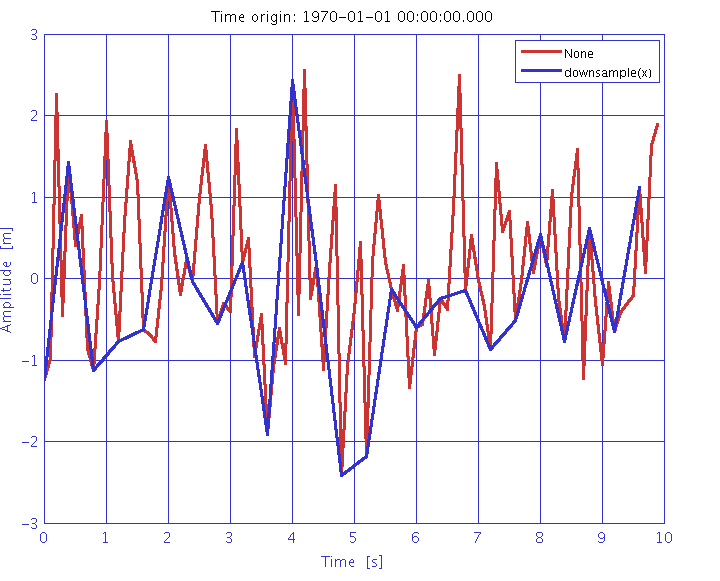
Below is a picture of how resmpampling may alter the rendered graph. The red line represents the original data curve, while the blue line displays the resampled one. This particular graph, however, displays a rather crude frequency of data. In the case of this application, such changes in the curve would amount to roughly 1-hour to 1-day resampling. Choosing lower frequencies (10-minute, 30-minute) would still cut down the loading time notably, without having major influence on the way the graph looks.
When to use resampling
Resampling is a powerful tool to cut down loading time, but comes at the expense of loss of granularity. Here are several rules of thumb for when to use vs. avoid resampling your data:
Choose resampling if you are interested only in general trends (such as temperature, moisture, light, etc.). These trends are clearly visible even under lower data frequencies, and downsampling will skew the overall picture very little.
Avoid resampling if you are interested in concrete numbers, such as the precise timestamp of a heating system being turned on. Resampling would skew the picture here, giving you imprecise (or averaged out) numbers.
Both options are fine (resampling and not resampling) if you wish to see only a short time period, such as several hours, or a single day. The graph should load quite fast in either case, so the overall impact on your experience should be minimal. That being said, resampling will still cut down the loading time.
Modifying data display type
Apart from resampling, there is also an option to modify the data display type. What this means is that you can choose the aggregation method for different periods of data.
Consider the following example: the data gets displayed, by default, at 1-minute intervals. This is the highest granularity available, as the API collects data at this frequency. However, you can choose to display the data at, say, 1-hour intervals. This means that the data will be aggregated over 1-hour periods, and the graph will display the average value for each hour. Now if you were not interested in averages, but rather, say, in the maximum value for each hour, you could choose to display the data with the display type (i.e., aggregation method) set to max.
The available aggregation methods are:
mean - show the average value of all data points in the period
max - show the maximum value of all data points in the period
min - show the minimum value of all data points in the period
last - show the last value of all data points in the period
With this, you can choose the aggregation method that best suits your needs. You can now choose from a number of different scenarios, such as:
Displaying the average temperature over 1-hour intervals
Displaying the maximum power consumption over 1-day intervals
Displaying the minimum light intensity over 1-week intervals
Displaying the last value of the heating system being turned on over 1-month intervals
and so on. Anyway, the choice is yours.